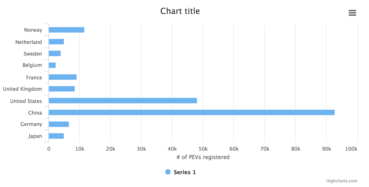
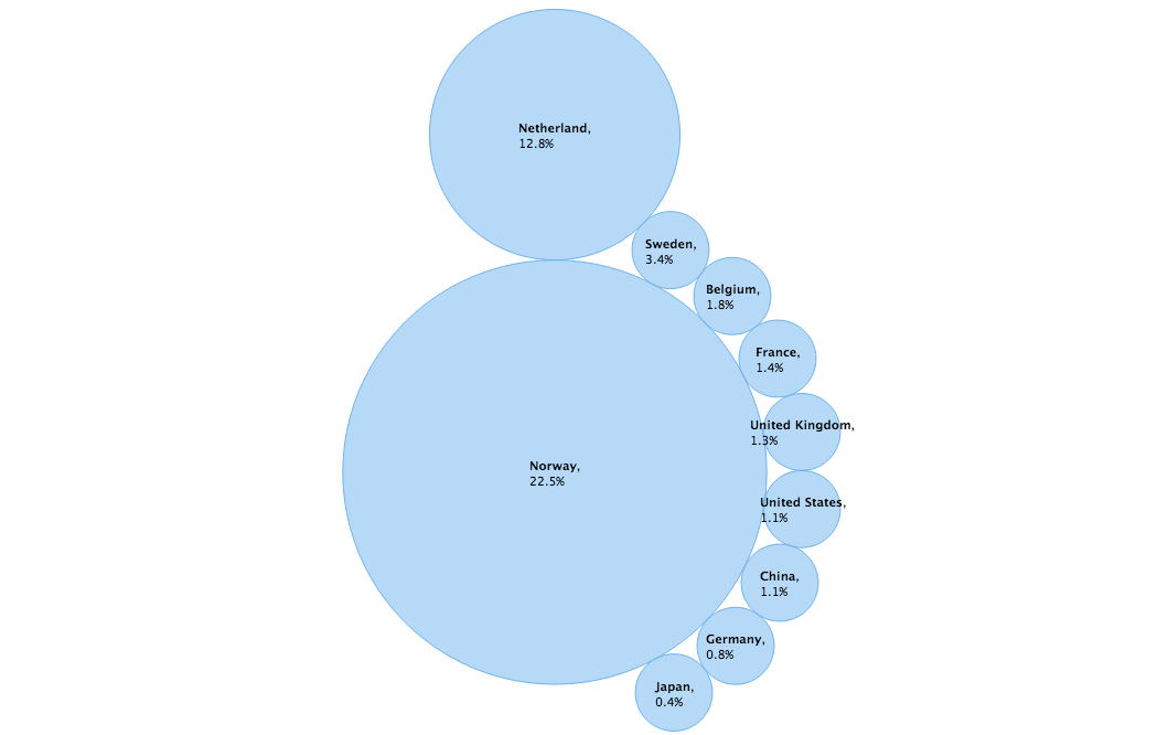
I think this Data visualization put too much information in one chart, and it is difficult to understand the content of the data. In addition, this showed the PEVs' registered number using circle, so it's herd to distinguish quickly where the point is. So if we devide this visualization into two or three chart and use bar chart for showing registered number, it looks better.